The Tree
While developing the idea of what we wanted to communicate with our new logo we created a list of words that embodied our core values. These words included: beauty, heritage, legacy, family, foundation, life and milestone. Once the list was complete we brainstormed ideas looking for a symbol that could embody some or all of these in an abstract yet timeless way. We came up with many options but the one that stuck with us the longest was the idea of a tree. We felt the tree was perfect because of how people use trees to mark special events in their lives. Some people plant trees in honor of others while others might plant them to mark a milestone in their lives. And some will even plant them as a thing of beauty to enjoy for many years to come. Given this understanding of how people might use trees we concluded that a tree would be the perfect image to help communicate our focus and direction. We are committed to creating images that are beautiful, can be left as a heritage or legacy and that represent a milestone in a family's life. The tree helps us to communicate this in a clear and memorable way. In our new logo mark we also retained a falling leaf to represent the changing of seasons. As seasons change the color and clothing of a tree our lives are marked by the changing of seasons as well. From love to engagement, from marriage to babies - each season is an opportunity to document your magic and preserve your memories. We kept the little leaf as a reminder about those seasons of life and how we want to be there to capture each one for you and your family.
The Fonts
For the main font face (used in the name Garcia) we wanted to move away from the slanted dynamic font used in the previous logo to something more timeless and which communicated an understated elegance and grace. The secondary font (used in the word Photography) was used to retain the strength and clarity of the previous font but with a slightly different vertical height that felt more balanced with the new main font. The tagline uses a font that is carefree yet elegant and can be used under the logo or alone without any loss of communication.
From the Magic to the Memories
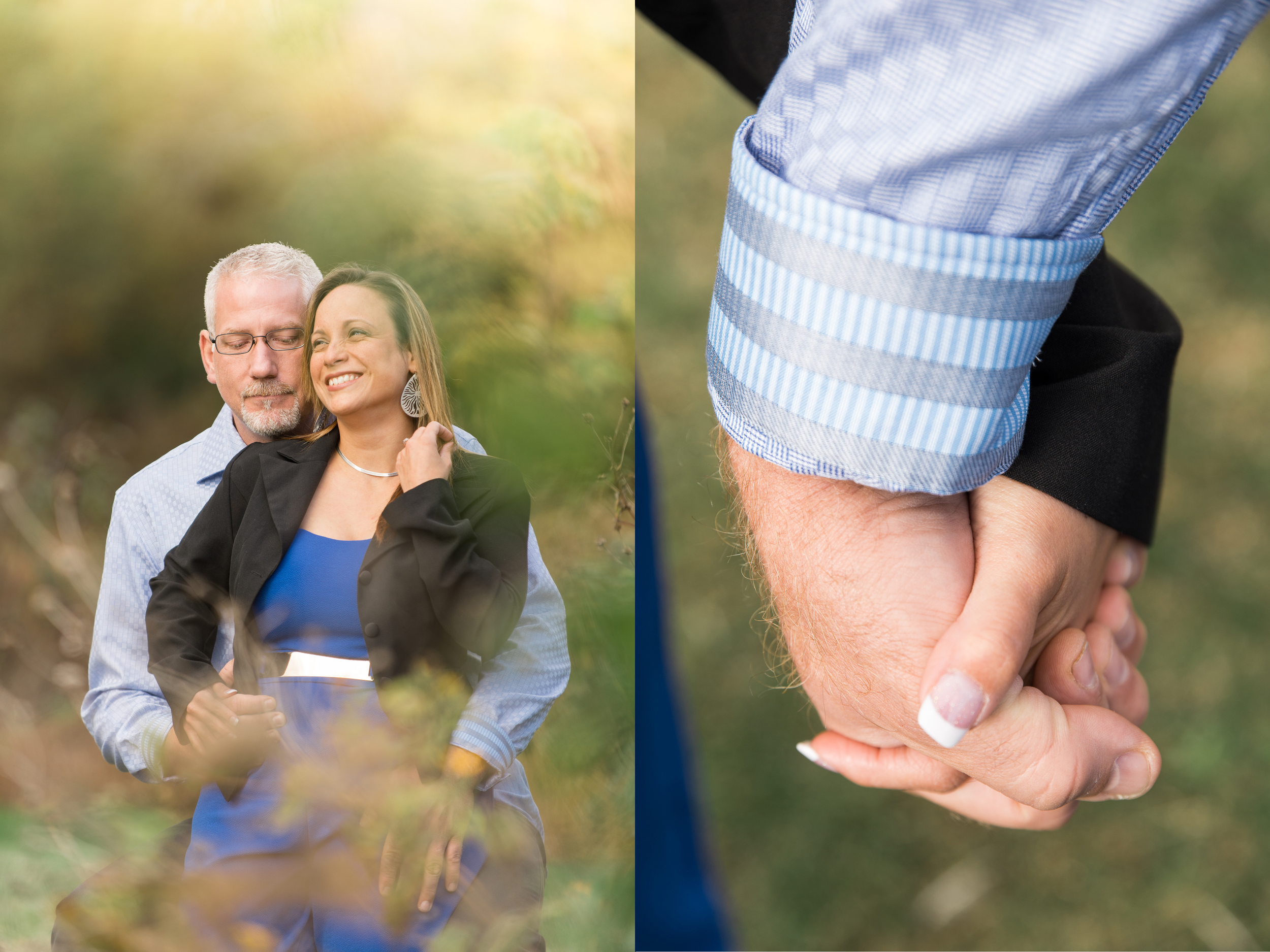
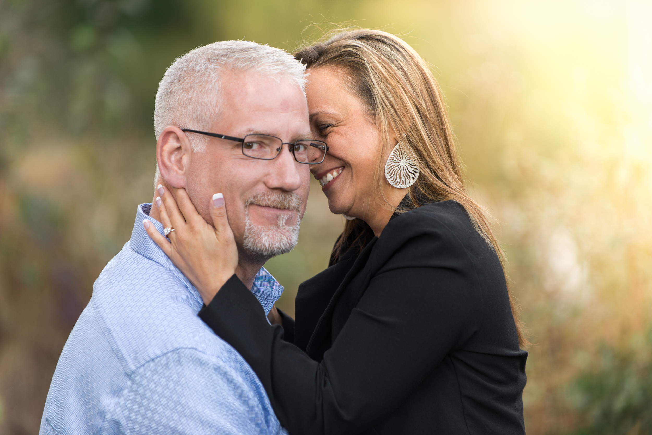
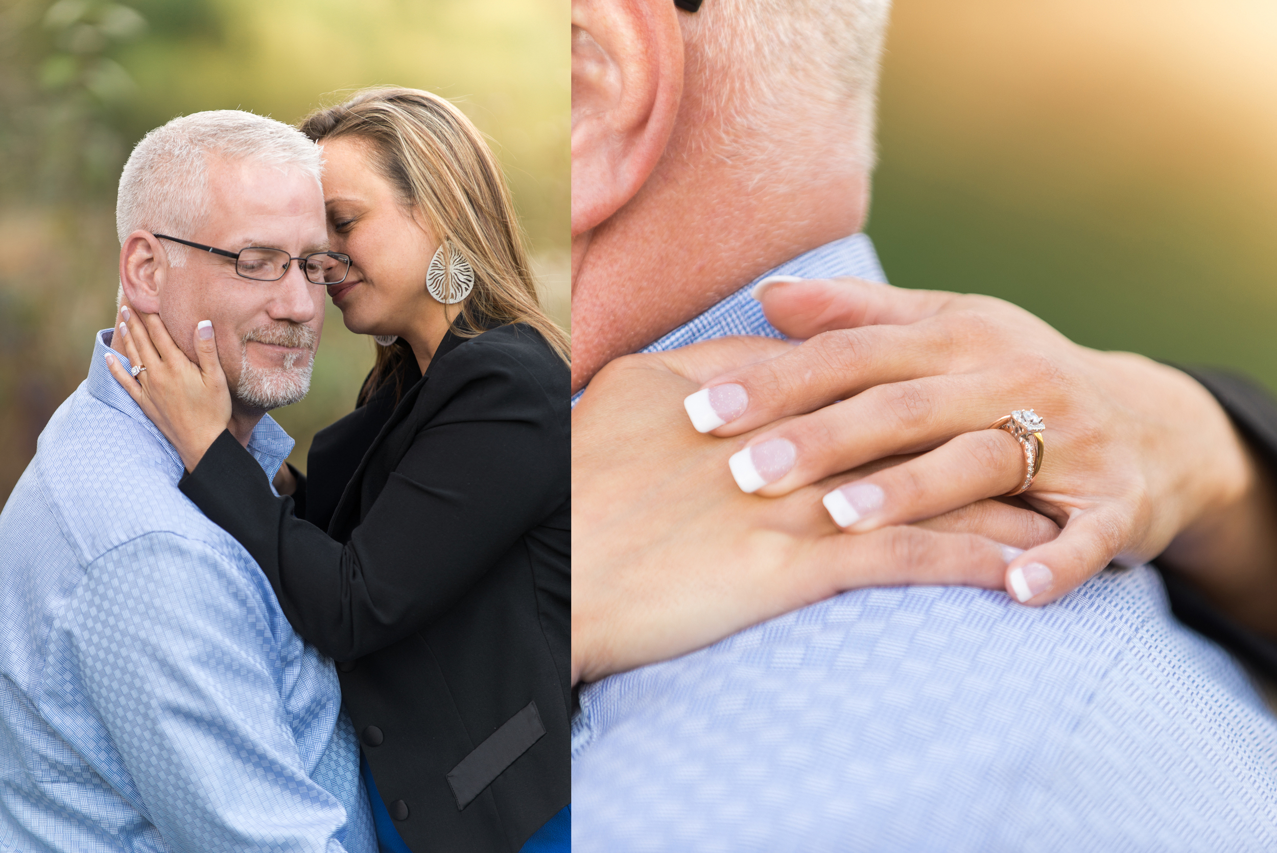
For the last few months we have embraced this phrase as a definition of what we do as photographers - creating images and creating wall art or heirloom albums. It is clear to us as we document the love between couples, family members and friends that we are capturing a special kind of relational magic. We are capturing the spark between individuals - what we call the "magic"- which we then preserve in tangible items - which we call the memories (i.e. heirloom albums, wall art, canvasses and more ). From the magic to the memories is a fancy way to describe the work we do when we create your images and then create the art pieces that preserve them.
The Colors
Burgundy and gold were the colors we used in our own wedding and are colors we have always cherished. We like burgundy because it communicates elegance, refinement and beauty all of which embodies the direction we will continue to take as we document and preserve milestone events for couples and families. The addition of gold helps to reinforce the message of elegance and refinement but adds to it optimism and luxury, aspects we hope we can continue to infuse into our work aesthetically.
On The Changing of Things
Changing a logo or brand is risky business. Sometimes it is well received while other times it is not. People get used to a certain look because it instills confidence and trust in a particular company or product. We understand this clearly, which is why we wrestled with this choice for a long time. While it may be presumptuous to think anyone really cares what our logo looks like, we do want you to know that we did not take this change lightly. We care not just about our photography and our brand but we genuinely care about you and want to retain your trust in us and in our work. Our hope is that the new logotype and logomark will be a reminder to you that we stand for all that is beautiful and worthy of our attention in the people we love and cherish and in the images we document and preserve. And while our logo is changing we are not, our commitment and focus is stronger than ever as we work to document your milestone moments. From your magic to your memories - that's what we did in 2015 and what we will continue to do even stronger in 2016.


